

Use this resource to complete the questions on the Budgetary policy – Data analysis worksheet.
Figure 1: Aggregate demand–supply diagram showing cyclical instability in economic activity
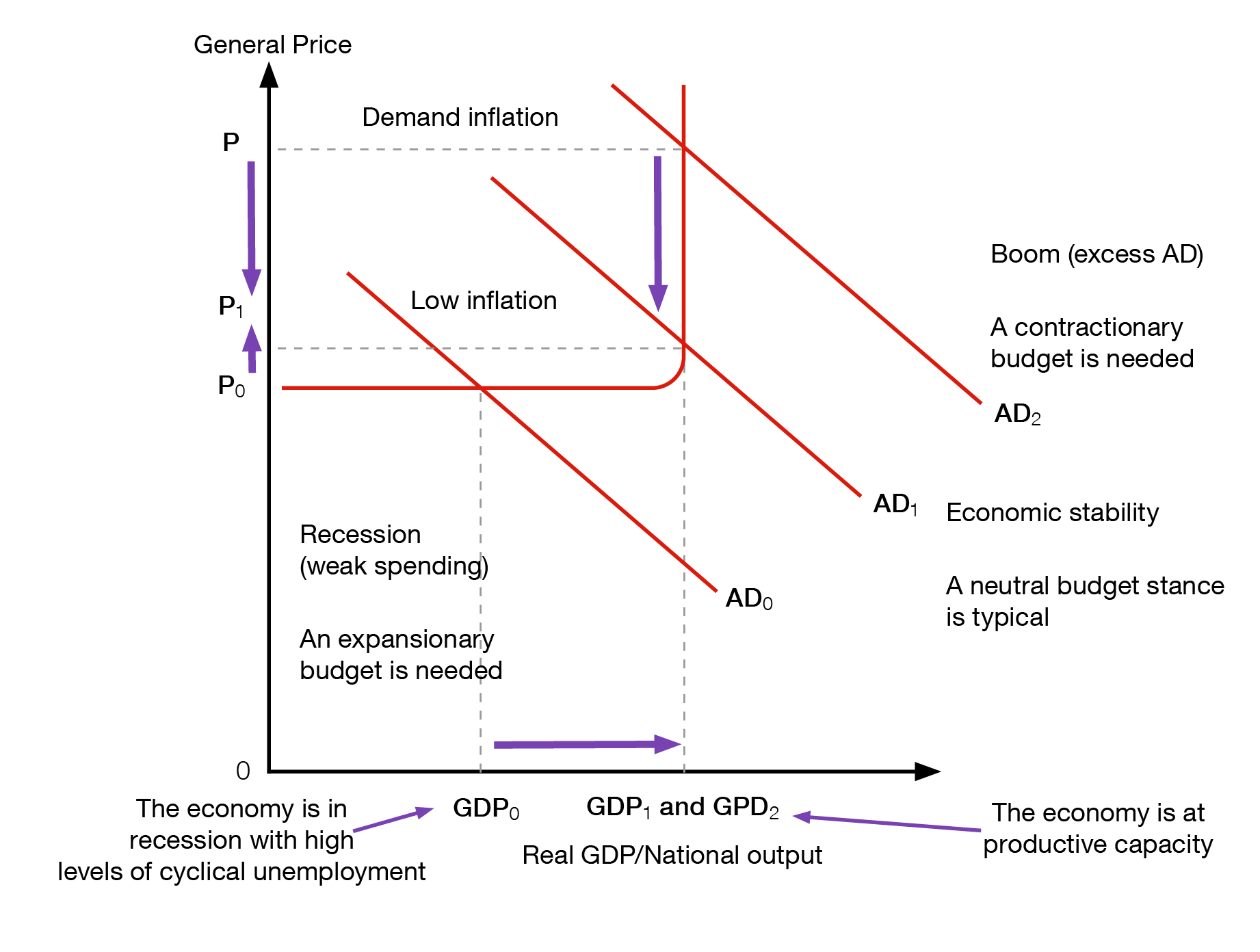
Aggregate demand and aggregate supply (AD/AS) diagram showing how budgetary policy stances can be used regulate aggregate demand and promote domestic economic stability. The vertical axis shows the general price level and the horizontal axis shows real gross domestic product (GDP) or national output. The aggregate supply curve, which represents productive capacity, changes from flat at its far left to vertical at its far right. The 3 aggregate demand curves (AD) are straight and downward sloping.
They show total spending on domestic goods and services at each price level, that is, as the price level rises, the amount of total spending on domestic goods and services declines. One aggregate supply curve is in the centre, labelled AD1 and crosses the aggregate supply curve at the point at which it changes from flat to vertical. There is a parallel curve to the left (AD0) and another to the right (AD2). The aggregate demand curve on the left shows low demand, or low levels of spending. Where the curve on the left (AD0) intersects with the aggregate supply curve, prices are low (P0) and there is weak economic growth (GDP0). The economy is operating at less than its potential productive capacity. With low levels of spending, the economy is in recession characterised by high levels of cyclical unemployment, low prices (P0) and weak economic growth (GDP0). In this circumstance, an expansionary budget stance is needed to boost aggregate demand and economic activity. If the government uses a budget deficit (higher government spending than tax revenue) to boost economic activity, the aggregate demand curve will shift to the right (AD1). Where this curve in the centre (AD1) intersects with the aggregate supply curve, there is low inflation (P1), strong and sustainable economic growth (GDP1) and full employment.
As the government has achieved its macroeconomic goals of full employment, stable prices and sustainable economic growth, a neutral budget stance is necessary to maintain a stable economy. A neutral stance is when the budget is in balance (government revenue is equal to government spending). The aggregate demand curve on the far right shows excess aggregate demand. Where the aggregate demand curve intersects with the aggregate supply curve, there is demand inflation or higher price levels (P2) and the economy is operating at its productive capacity (GDP1). Therefore, in this situation where there is a boom economy, price levels have risen without any increase to the economy’s productive capacity. In this example, because of the risk of inflationary pressures, a contractionary budget stance is needed to slow AD (moving AD1 to AD2), and inflation (P1 to P2). The government has used a budget surplus (when government spending is lower than government revenue) to move towards domestic economic stability where there is low inflation, strong and sustainable economic growth and full employment.
Table 1: Australian Government accrual revenue, expenses and fiscal balance
|
Fiscal Year |
Fiscal revenue ($m) |
Fiscal expenses ($m) |
Fiscal balance ($m) |
|---|---|---|---|
|
2007–08 |
$303,402 |
$279,862 |
$20,948 |
|
2008–09 |
$298,508 |
$324,188 |
–$29,743 |
|
2009–10 |
$292,387 |
$339,829 |
–$53,875 |
|
2010–11 |
$309,204 |
$355,667 |
–$51,760 |
|
2011–12 |
$337,324 |
$377,220 |
–$44,746 |
|
2012–13 |
$359,496 |
$381,980 |
–$23,472 |
|
2013–14 |
$374,151 |
$414,047 |
–$43,746 |
|
2014–15 |
$380,746 |
$417,898 |
–$39,857 |
|
2015–16 (e) |
$396,396 |
$431,470 |
–$39,429 |
|
2016–17 (e) |
$416,862 |
$450,553 |
–$37,129 |
|
2017–18 (e) |
$449,524 |
$464,812 |
–$18,675 |
|
2018–19 (p) |
$484,370 |
$489,324 |
–$9,839 |
|
2019–20 (p) |
$515,062 |
$511,604 |
–$2,059 |
e) Estimates.
(p) Projections.
Source: Budget 2016–17. Budget Paper No. 1: Budget Strategy & Outlook
Figure 2: Indicators of Australia’s macroeconomic conditions 2008–2017
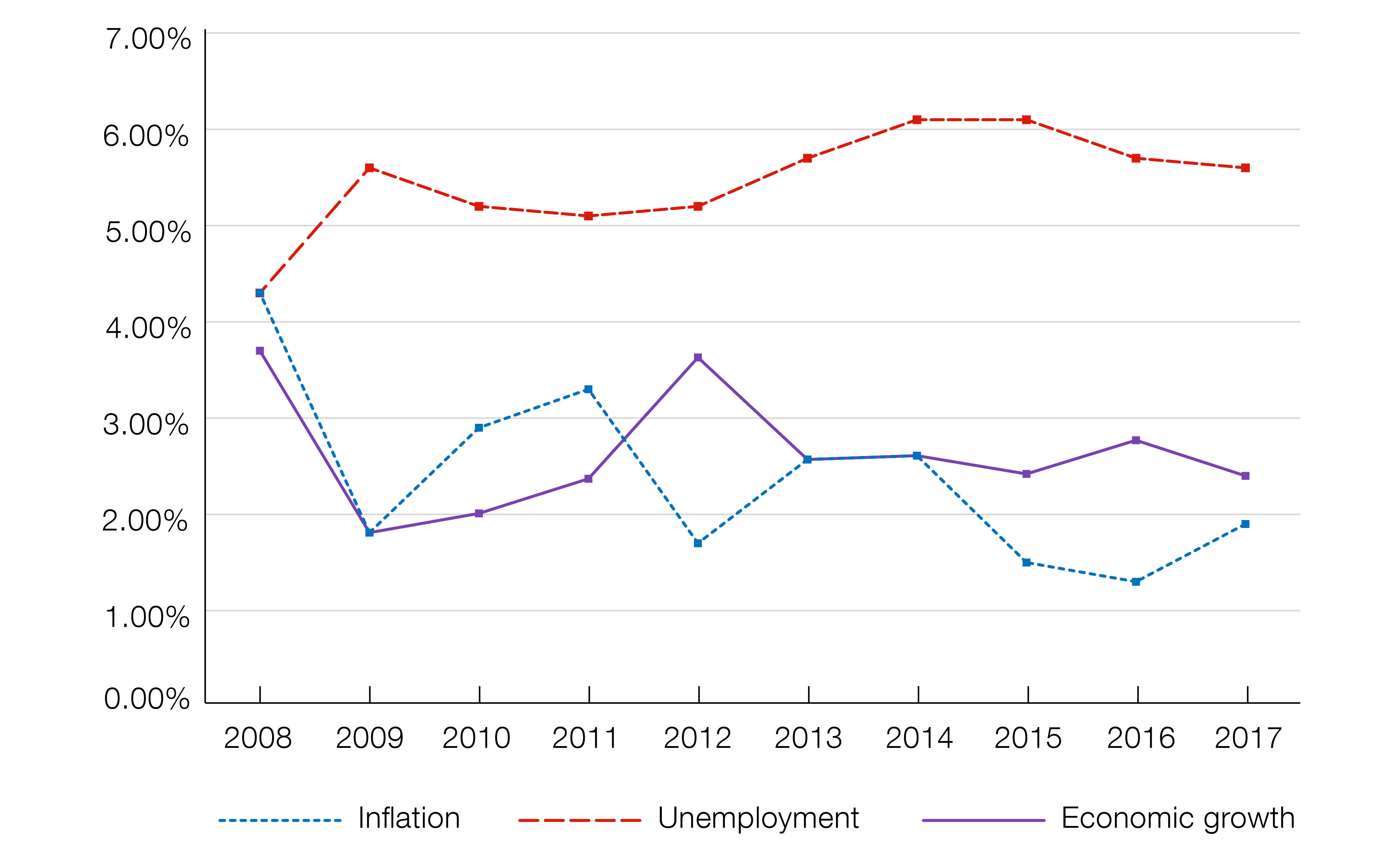
Line graph showing Australia’s macroeconomic conditions for the 10-year period between 2008 and 2017. The vertical axis shows percentages in increments of 1%, beginning at 0 and ending at 7%. The horizontal axis shows years, beginning with 2008 and ending with 2017. There are 3 line graphs, one for inflation (light blue), one for unemployment (red) and one for economic growth (purple). The trends in the inflation rate and economic growth show consistent increases, followed by decreases over the 10-year period. The unemployment rate over the 10-year period ranged between around 4% and 6%. These rates, to the nearest percentage point, were:
|
2008 |
2009 |
2010 |
2011 |
2012 |
2013 |
2014 |
2015 |
2016 |
2017 |
|
|---|---|---|---|---|---|---|---|---|---|---|
|
Inflation |
4.3 |
1.8 |
2.9 |
3.3 |
1.8 |
2.6 |
2.6 |
1.5 |
1.3 |
1.9 |
|
Unemployment |
4.3 |
5.6 |
5.2 |
5.1 |
5.2 |
5.8 |
6.1 |
6.1 |
5.8 |
5.7 |
|
Economic growth |
3.8 |
1.9 |
2 |
2.3 |
3.7 |
2.6 |
2.6 |
2.4 |
2.8 |
2.4 |
Source: ABS 6202.0 – Labour Force, Australia, Aug 2017; 5206.0 – Australian National Accounts: National Income, Expenditure and Product; Reserve Bank of Australia
Linked activity: