

Part 1: Budget forecasting errors over time
Errors in Budget forecasting are often represented as a percentage of the total economic output of a country, or gross domestic product (GDP). This is a more realistic measure of the size of a Budget forecasting error as it is relative to the size of an economy. The errors in Budget forecasting represented as a percentage of GDP are shown in the table below.
Errors for One-Year Forecasts, as a Percentage of GDP, 2011–2022
|
Year ending 30 June |
Budget outcome as % of GDP |
Error in forecasts as % of GDP |
|---|---|---|
|
2011 |
-3.3 |
-0.4 |
|
2012 |
-2.9 |
-1.4 |
|
2013 |
-1.2 |
-1.3 |
|
2014 |
-3.0 |
-1.9 |
|
2015 |
-2.3 |
-0.5 |
|
2016 |
-2.4 |
-0.3 |
| 2017 | -1.9 | -0.3 |
| 2018 | -0.6 | 1 |
| 2019 | 0.0 | -0.8 |
| 2020 | -4.3 | -4.7 |
| 2021 | -6.5 | 4.5 |
| 2022 | -1.4 | 3.6 |
- Graph the Budget outcomes and errors in percentage forecasts for the period between 2010-2022 on one chart.
- What type of graph did you select to use?
- Why did you choose this type of graph?
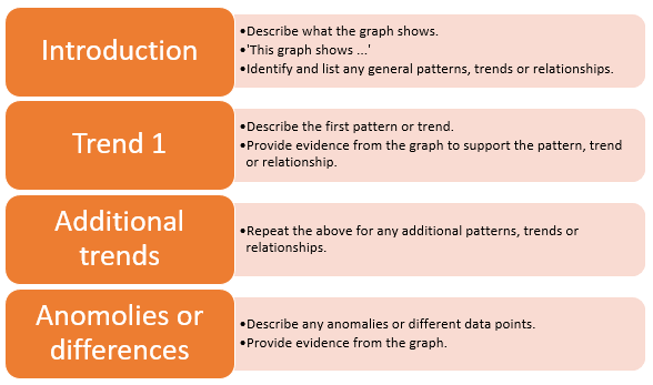
- Interpret the graph and write a paragraph describing your interpretation using the following framework.
Framework for interpreting graphs
Part 2 – Distribution of Budget forecasting errors
- Open a spreadsheet and put the percentage errors in a table with the following headings.
Percentage error 1.4 0.4
....etc.
Average (mean) Median - Use the SORT function to sort the percentage errors from lowest to highest.
- Set up formulas to calculate the average (mean) and another to calculate the median.
- What is the average percentage error? What is the median percentage error?
- Are these figures similar? Which one is higher and why?
- On the same spreadsheet (you should have a bit of space to the right of your first table) set up another table like this:
Category
Number of errors in this category
-5 to -4
-4 to -3
-3 to -2
-2 to -1
3
-1 to 0
0 to 1
1 to 2 2 to 3 3 to 4 4 to 5 - Count the number of percentage errors in each category and add this information to the table. The -2 to -1 range has been done for you.
- Put in a formula at the bottom of the column to add up the number of percentage errors you have. If the Total is not 12, check the information you’ve entered.
- Insert a chart to display this information. Choose your style and colours. Make sure the chart has labels and a title. Refer to Building charts and tables – How-to-sheet.
- Describe the overall pattern of the data (shape, center, spread), and any deviations from the pattern (outliers). If necessary, use the framework provided above.
Linked activity: